My March 2021 bullet journal design was my most satisfying, yet challenging design to complete. The theme for the month was the Seventies since I’m a child of the Seventies and I love all things related to that decade. I really like the designs and graphics related to the era and wanted to incorporate them into my journal set up.
The Design Process
The Seventies theme required a lot of research because I wanted to get the aesthetic just right. I scoured the internet searching for everything from the clothing, to fonts, to patterns, to color schemes. Anything Seventies related I looked at and saved to my Pinterest boards.
The Cover Page
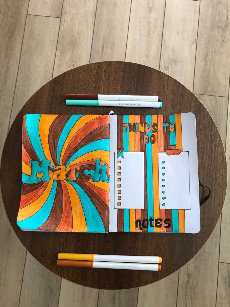
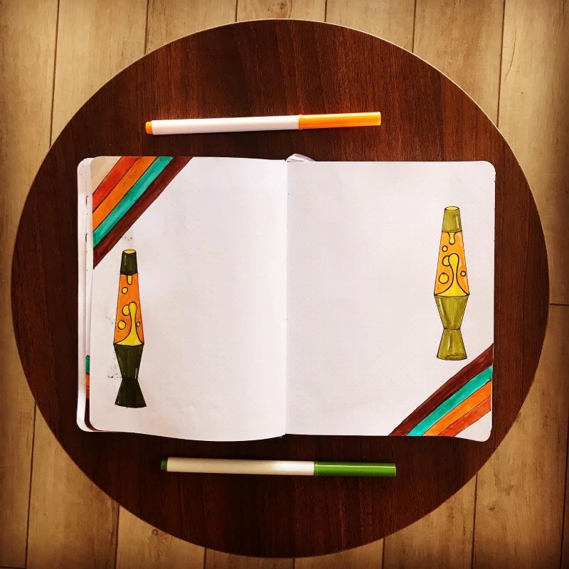
Once everything was saved, I started designing the March cover page. For the cover, I went with a bold color scheme that was all Seventies all day. I used my Crayola Super Tip markers to create both pages. I used the teal, brown, bright orange, and deep orange colors to create the patterns on both pages.
The fonts were tricky to create. However, I found a Seventies font generator that gave me some ideas on what fonts to use for all of my spreads. I just typed the titles into the generator and printed them out. I used them as a guide to draw the fonts on each page of my spread.
The Calendar Spread
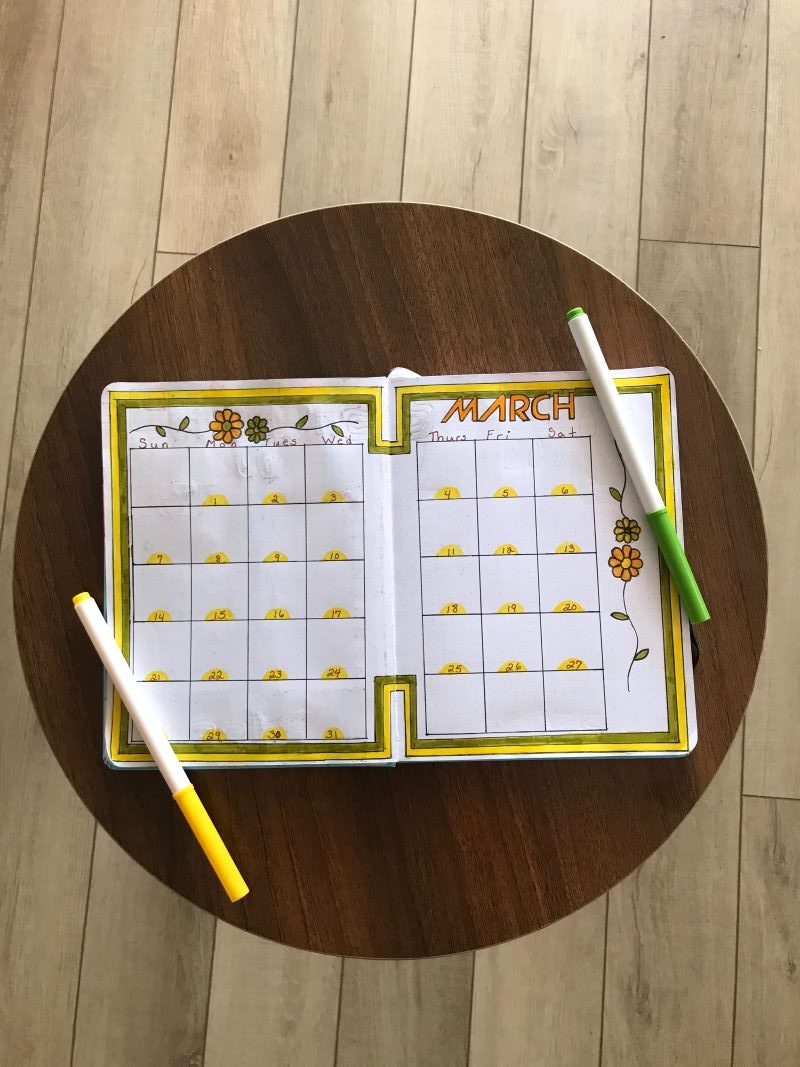
For the calendar pages, I used yellow and avocado green as the color scheme for the spread. I added some groovy Seventies type flowers to decorate the top and sides of the calendar. Finally, I used a futuristic Seventies font for the title.
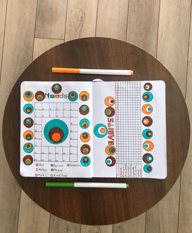
The Mood and Habit Trackers
My mood and habit trackers were tough to design because I had a hard time coming up with a pattern that was easy enough for me to draw in my journal. I ultimately decided to draw a circle pattern that I found online that only required the use of my circle stencil to recreate the design. I used the same color scheme as the first two pages of the spread to tie it all together.
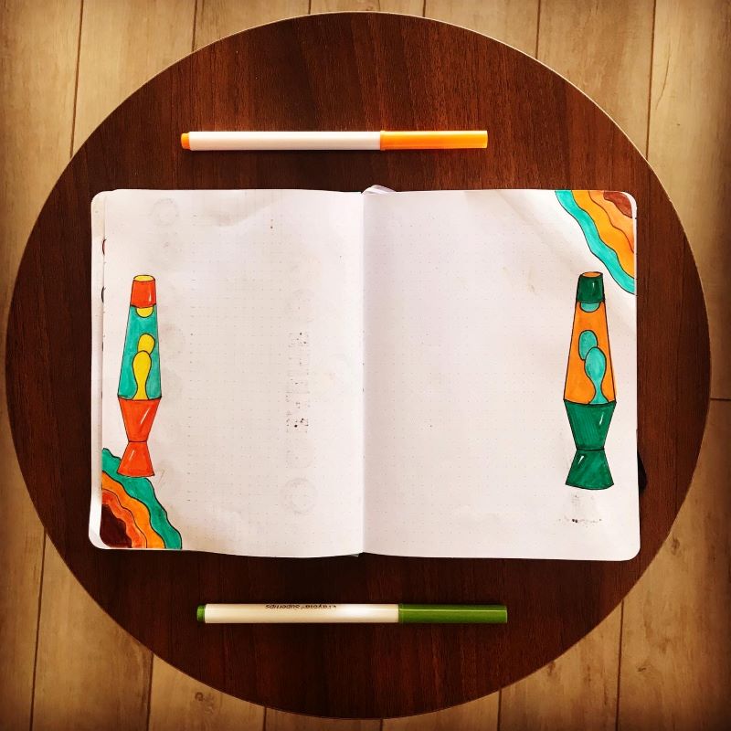
The Weekly Spreads
For the final four pages of the spread, I drew lava lamps in vibrant Seventies colors to round out the theme. They were the best addition to the entire design. They turned out beautifully and were a joy to look at each week when I wrote out my thoughts and feelings.
Overall, I think this is one of my best designs to date and I’m really proud of how it turned out.
Tell me your thoughts in the comments below.


